As the only designer on the team, I worked with journalists and engineers from The Daily Princetonian, among the oldest college newspapers in the nation, to create Princeton's inaugural first-year survey. I designed the visual identity and user experience. With approximately 100 graphs and over 700 respondents, this website balanced both extensive visual data and simple user experience.
visual identity
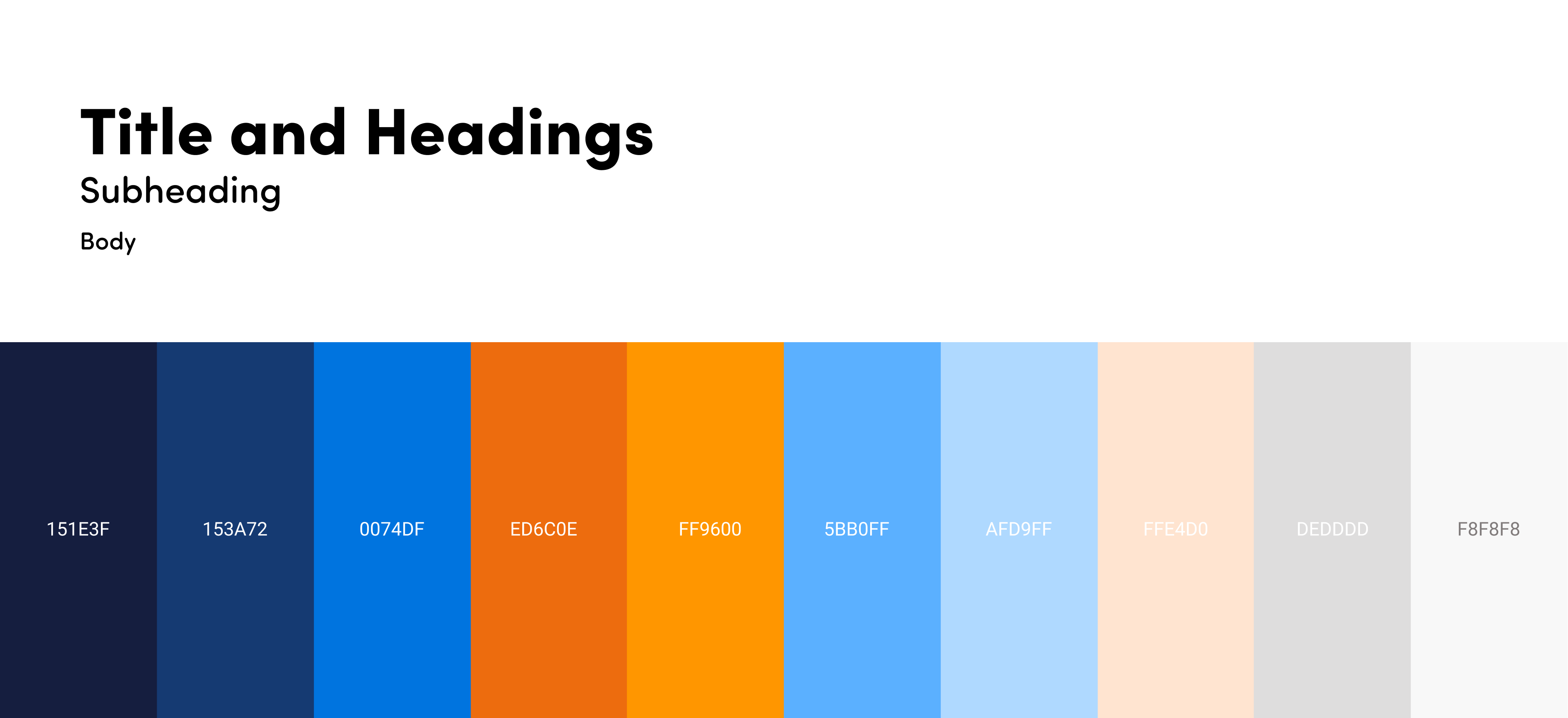
Developing the visual identity
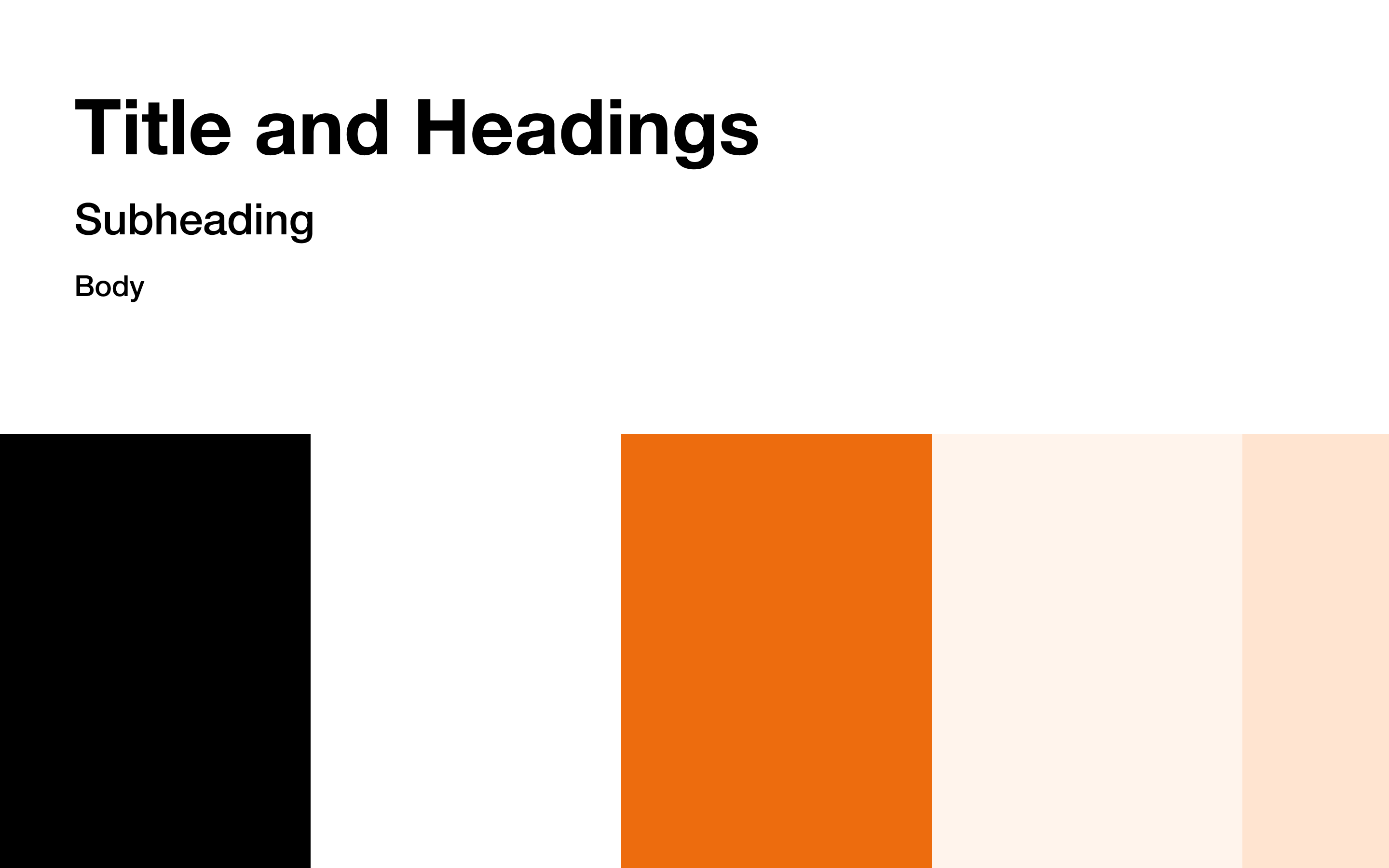
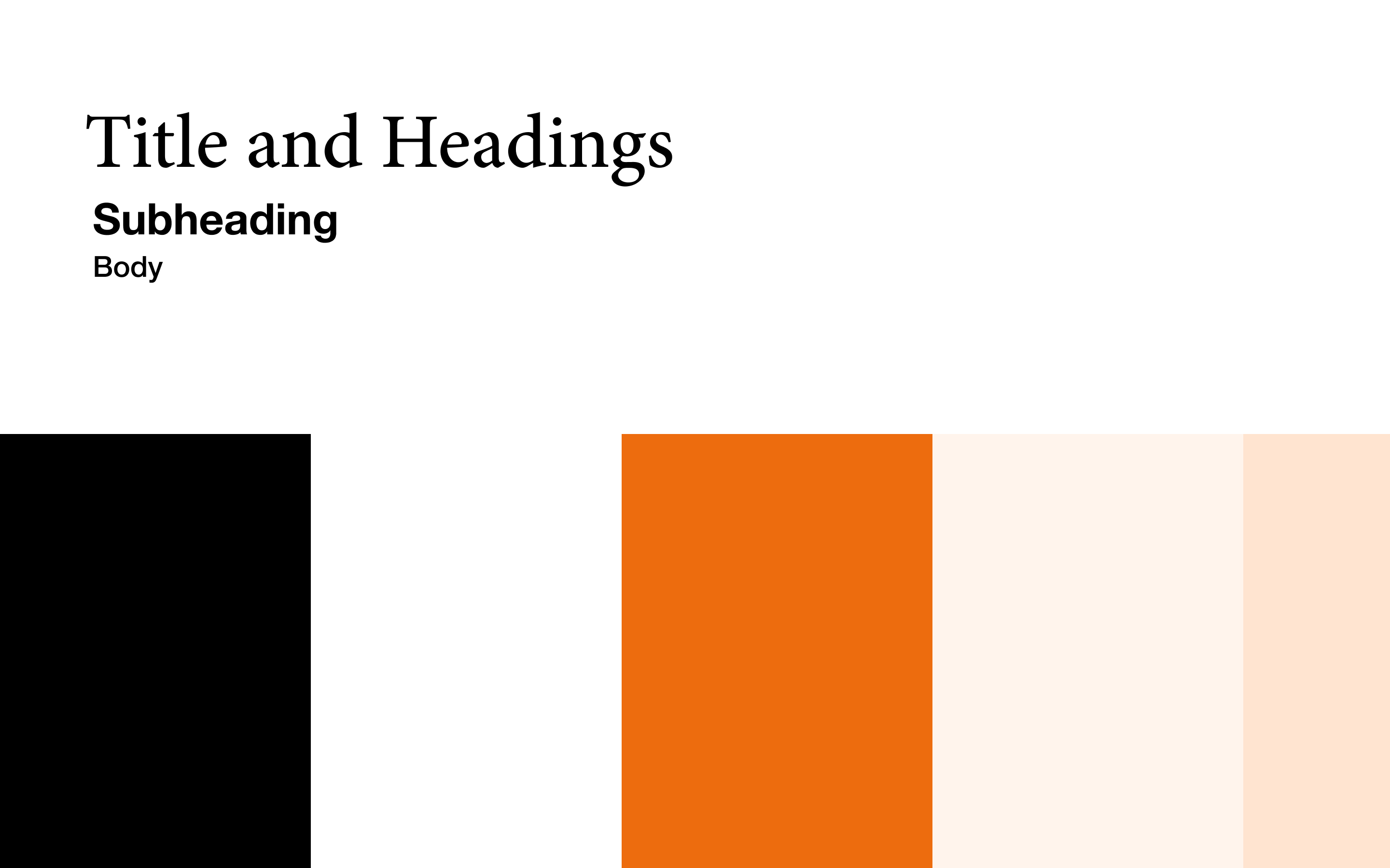
After speaking with the Project Director and the Creative Director, I narrowed down the descriptors that best defined the experience we wanted the users to feel. I developed two style guides:
Welcoming
Informational
Data-driven
The directors wanted to go in a new direction that felt less "University" based.
The winner was inspired by FiveThirtyEight.com
Website
A Figma affair
I developed the website layout on Figma. The website was broken down into two major parts: Narratives and Data Exploration.
The Narratives
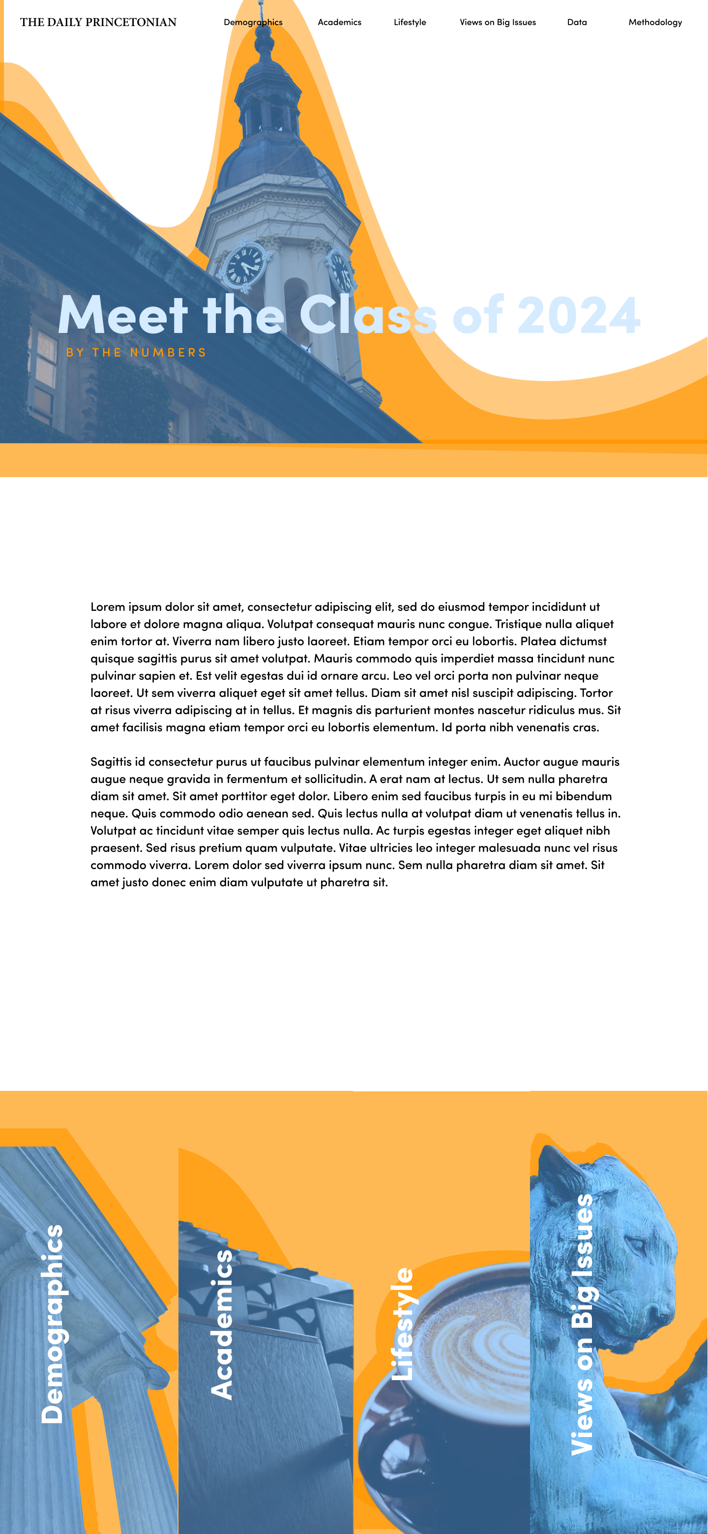
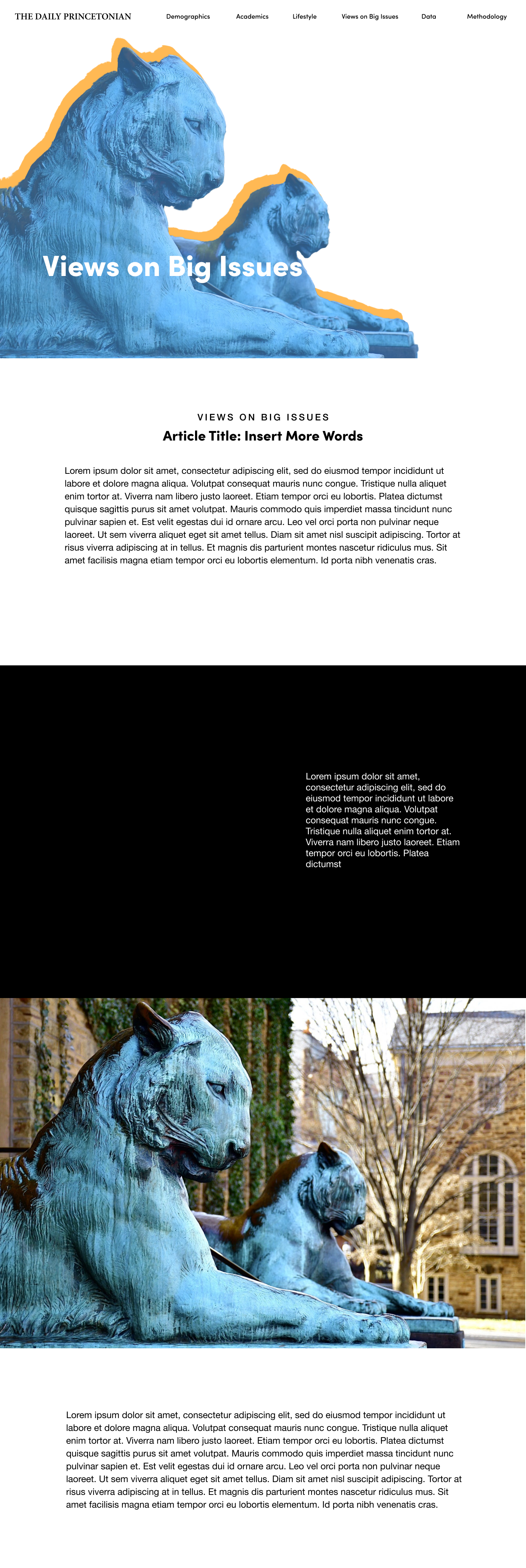
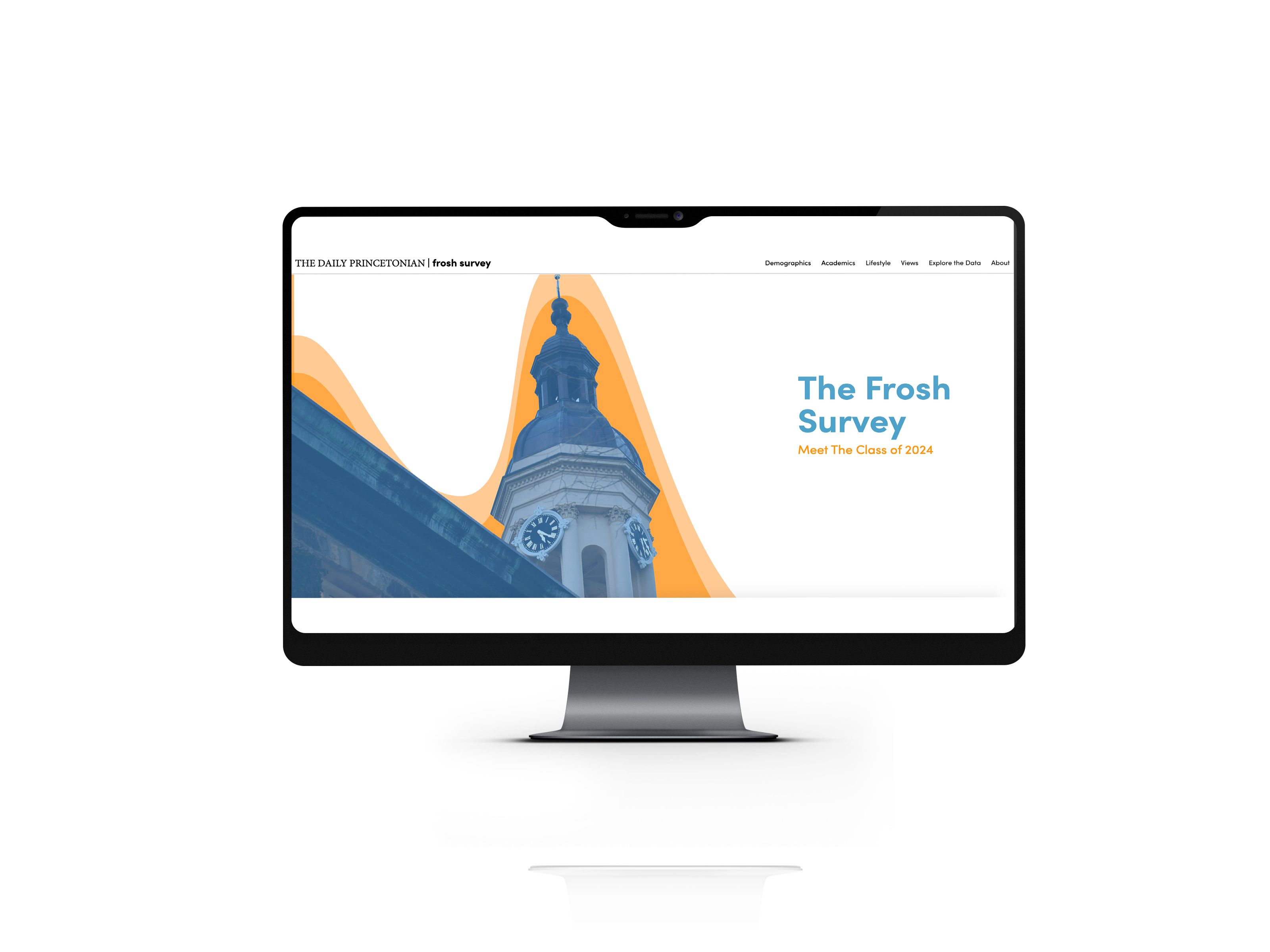
There were four overarching sections to match the data collected: Demographics, Academics, Lifestyle, and Views. Each section had an associated narrative that was accompanied by the graphs. I developed a central home page that introduced the overall website and created section headers for each of the 4 narrative sections.
One of the Section Narratives
Explore the data
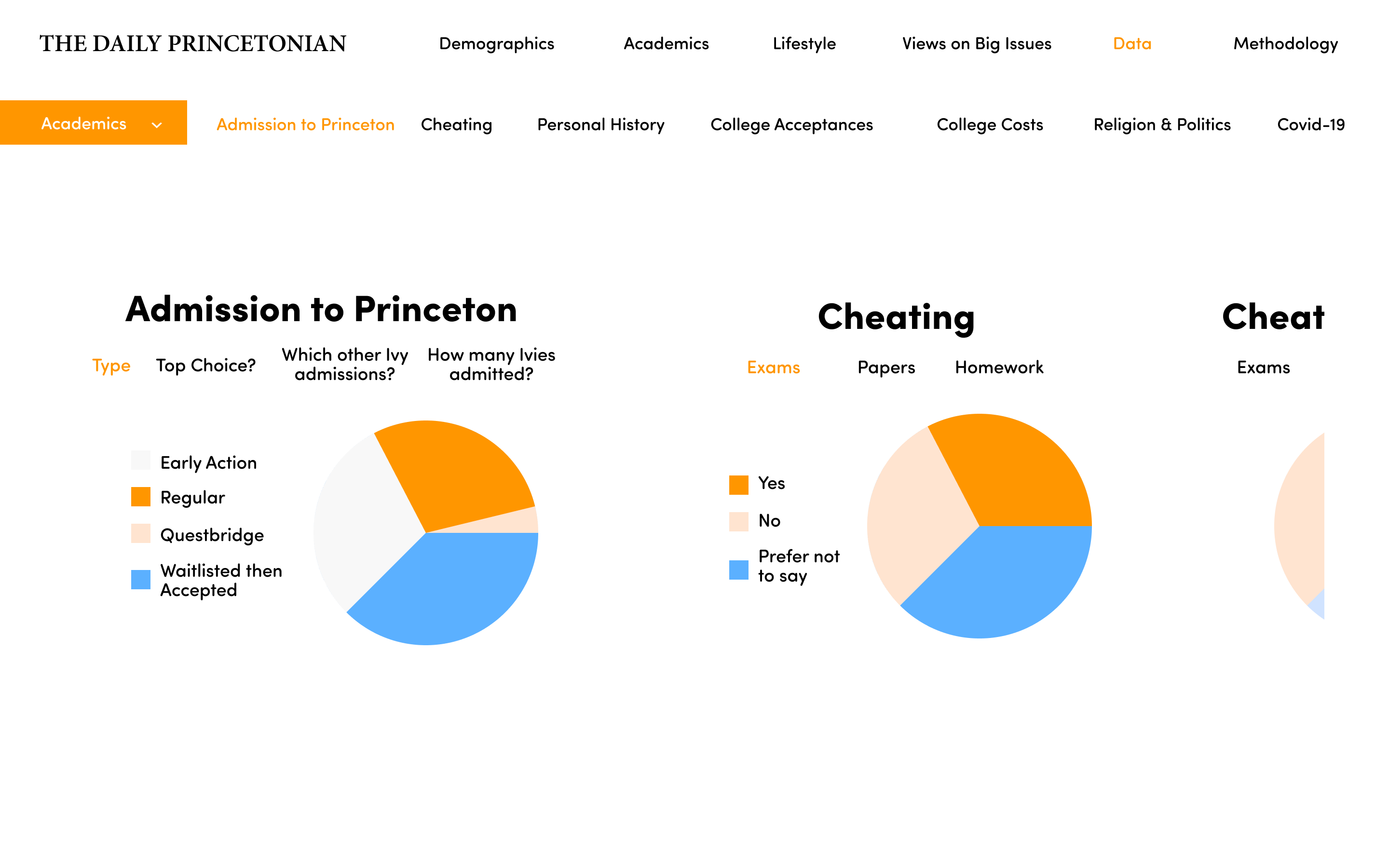
Given the nature of such a robust data collection, we wanted to create a place for users to freely explore the data. My initial design incorporated a horizontal scroll to view multiple graphs at once and section tabs to help the users search within and across each of the 4 sections.
A few changes
As we asked other members on the team to use the mockup and after running into some technical obstacles, it was decided that a vertical scroll would be the best option for the data section. Ultimately, the website looked like the following using Datawrapper to build the graphs. I'm incredibly proud of my team and to have designed Princeton's inaugural first-year survey.