7 weeks
UX Researcher & Designer
Adobe XD
Adobe Illustrator
Adobe Photoshop
Caren JuUX Researcher & PM Intern
Alexa Maniaci PM @ Def Method (DM)
First released in 2016, the Just Not Sorry (JNS) plug-in on Google Chrome had over 30,000 users when I joined Def Method as a Design Intern June 2020.
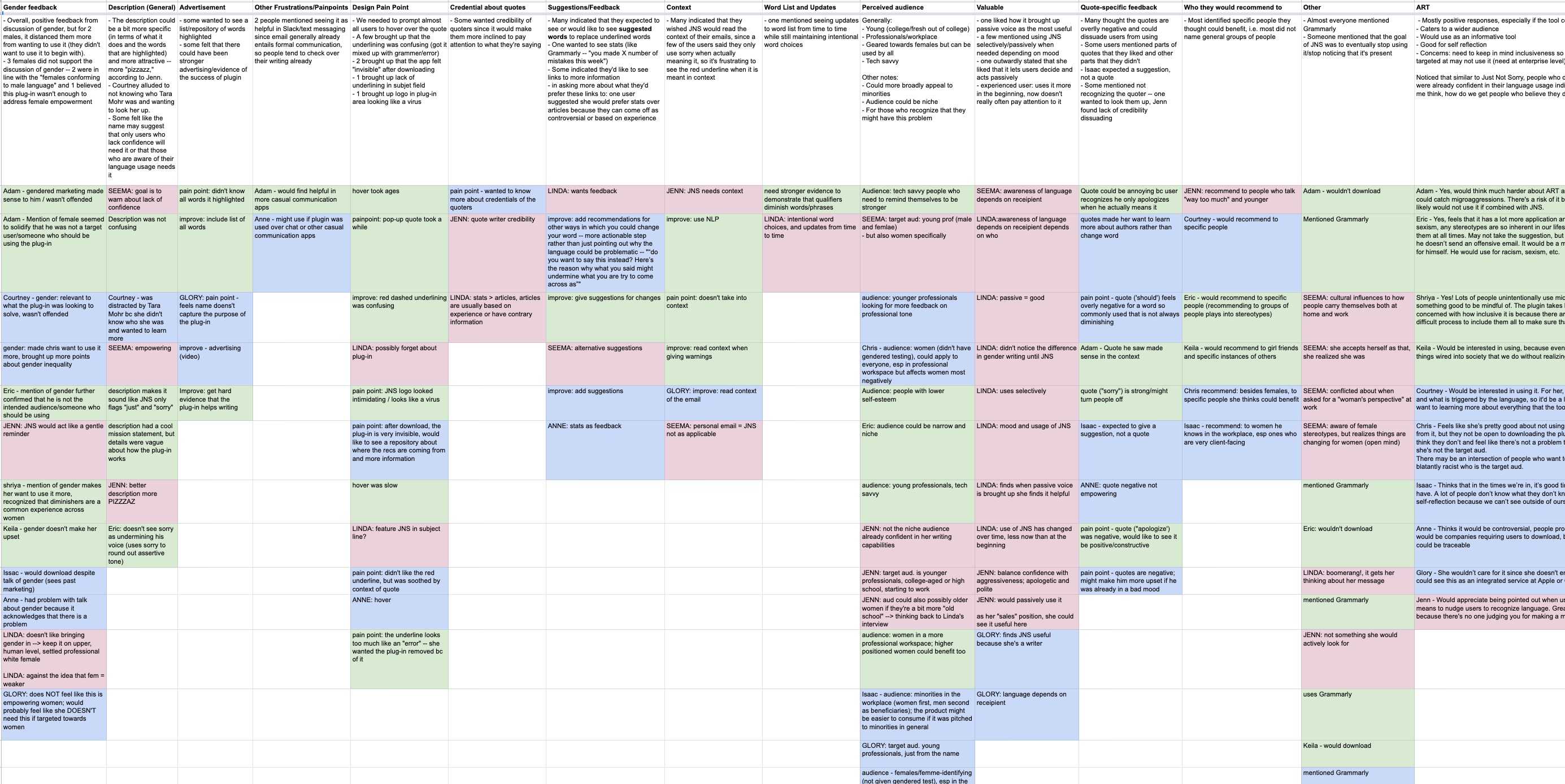
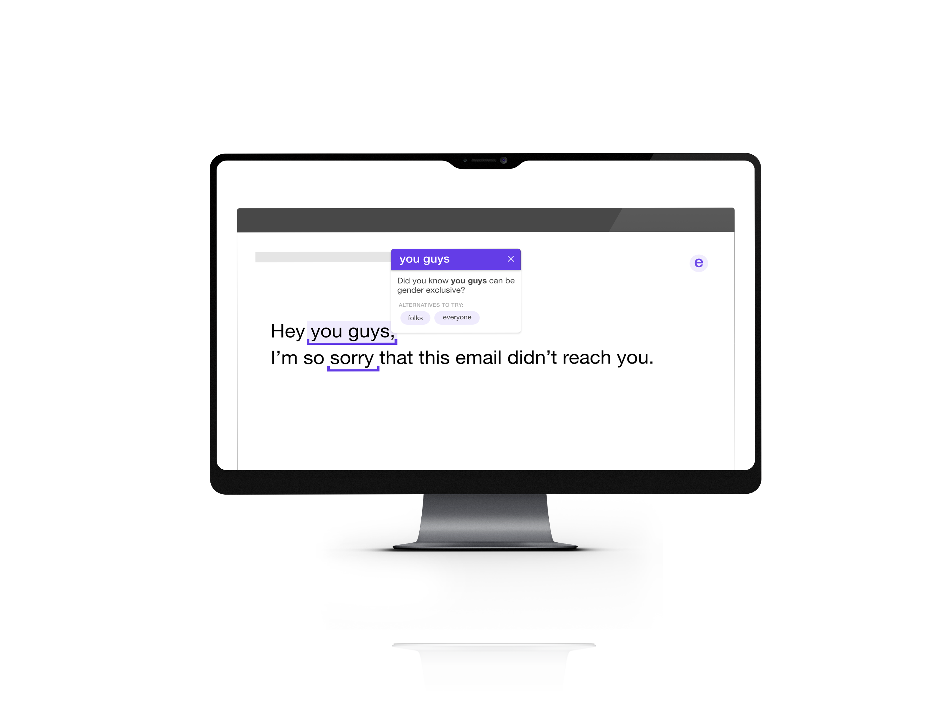
JNS's goal is to help users write more confident emails by flagging words that indicated weak language usage. The original inspiration stemmed from the writings of feminist author, Tara Mohr, and one of the initial intents was to help women write more confidently.
In response to the origins of JNS, a few articles arose arguing that JNS was, in fact, perpetuating the idea that women need to conform to men's standards and, additionally, that JNS is applicable to more groups of people beyond women.
What initially seemed like a simple challenge became a question of the product direction as a whole.
Below is a promo video we made, currently on the Chrome Description page. It displays how the previous version of JNS functions.
"How can we improve the user experience and address the controversial gender origins of the JNS?"
A. User Interviews
We conducted 12 user interviews in 3 age categories in order to form user personas:
Young, college-aged students
Younger professionals (working for about 4-5 years)
Settled professionals - had a family and 40+ of age
We carried out two types of interviews:
User Tests: Interviews and testing the product with new users who had no experience working with JNS.
Interviews with Existing Users: Interviews with users who were familiar with JNS, one of whom was Professor Janet Davis from Whitman College who Def Method had worked with previously to develop JNS.
I learned a lot through the experience, adjusting our interviews and how I approached questions with each interview.
I kept in mind to avoid leading questions, yes/no questions, and allowed the user to lead the conversation by embracing silence.
B. Synthesizing Information
After conducting our interviews, we organized our findings into a spreadsheet categorizing key quotes, responses, and pain points:
From this, we developed the ideal user persona:
C. A Pivotal Moment
Initially, we asked the question of whether or not we should include gender in the marketing of JNS. We conducted A/B tests during our interviews, one with a Chrome description mentioning the original goal of helping female users and a gender neutral version.

The quotes displayed after hovering over a word and the name of the product both have negative connotations and evoked defensiveness in our users.

Users categorized the "ideal" target as unconfident communicators. This associated a negative connotation with the "ideal" user.

We saw a trend in users who did enjoy our product: they were aware of how sensitive language usages are whether it stemmed from being a part of a minority group or observing the sensitiveness of language use in the lives around them.
The (then) current JNS presented itself as a way to fix rather than empower.
Our epiphany.
This caused a few of our users to dissociate themselves as ideal users because they didn't believe they needed to fix their language usage. We also noticed that in our small sample of users, those who were more readily open to this product were more aware of the sensitivity of language usages in other contexts such as inclusivity.
After analyzing our findings, we reoriented our perspective from fixing to empowering. Doing so simultaneously solved our initial question of whether or not to include gender.
D. A New Direction
Empower users and their recipients.
Once we gathered our findings, we proposed two pathways:
Plan A: Rebrand
Completely rebrand JNS with a new name and the capability of suggesting inclusive words.
Pros:
With such a large existing user base, the new plug-in would update on existing users' Chrome Plug-in without having to rebuild a user base.
Cons:
Such a large change to our product may confuse existing users.
Plan B: Build a separate plug-in
Build a second plug-in and launch separately.
Pros:
Avoid confusing the existing user base by building a separate product vs. updating the current.
Cons:
It would take a while to gather our user base and reach.
And we developed a product roadmap with priorities:
We proposed these plans at the end of our internship to the company. I developed my prototyped solution after my internship and is not affiliated with Def Method.
E. A Prototyped Solution
Balancing gentle nudges and alternative options.

.gif)
Based on our user interviews and the reviews on Google Chrome Plug-ins, the hover was a major pain point. Users complained that it was hard to differentiate the indicator from Gmail's built in spell-checker and other popular tools like Grammarly. By using a visual highlight and a unique underline, this indicator differentiates itself while remaining easily noticeable.
.gif)
When it comes to words like "sorry", their appropriateness relies heavily on the context. Because natural language processing was not a feasible option for this project, this was the alternative I designed. Rather than providing the same, sometimes condescending quote upon hover as the current version of JNS does, my design asks questions as a way to nudge users to reassess their current usage, maintaining the power in the user's hands.
Research has been done by psychologists and behavioral economists alike about the simplicity, yet robustness of nudges.
.gif)
Inclusive language can empower email recipients. Opposed to the previous example of nudges, alternatives are provided here. This was because alternatives do not vary as much as words like "sorry" according to their context. Alternatives offered here empower the recipients while retaining the original message's meaning.
.gif)
Visual feedback is given to help users view their progress immediately. A "score" is calculated and presented with 5 dots. The decision to exclude descriptive or numerical ratings like "Great!" or "97%" was a deliberate design choice to avoid defining and criticizing the user. Instead, these 5 dots provide a visual feedback, using only colors and quantity of dots to communicate the rating.
Through immersing myself in this process from research to prototyping, I can appreciate the power of user research even more. What started off as research regarding an innocent problem transformed into a complete product shift.
Working on this project opened my eyes to how I can become a better UX researcher. I learned from each interview ways to better balance guiding the conversation while letting the user speak their thoughts.
This project showed me the sensitivity around designing with intention. Reading about it is one thing while applying it can be another. In this project's case, providing alternatives ran on a fine line between controlling how people's messages and offering helpful alternatives.
I thank Alexa and Kathy (my mentor) for allowing me to shape my internship so I could take on this project.
Shoutout to Caren for being an awesome co-intern on this project!