Solution
A. Initial Concept
In the span of 6 hours we developed our idea and prototype: we developed a Spotify plug-in that allows users to sync their listening experience with others around them. The listener can also switch his/her listening experience to public for others to join in.
B. The Redesign
Rough wireframes and ideation.
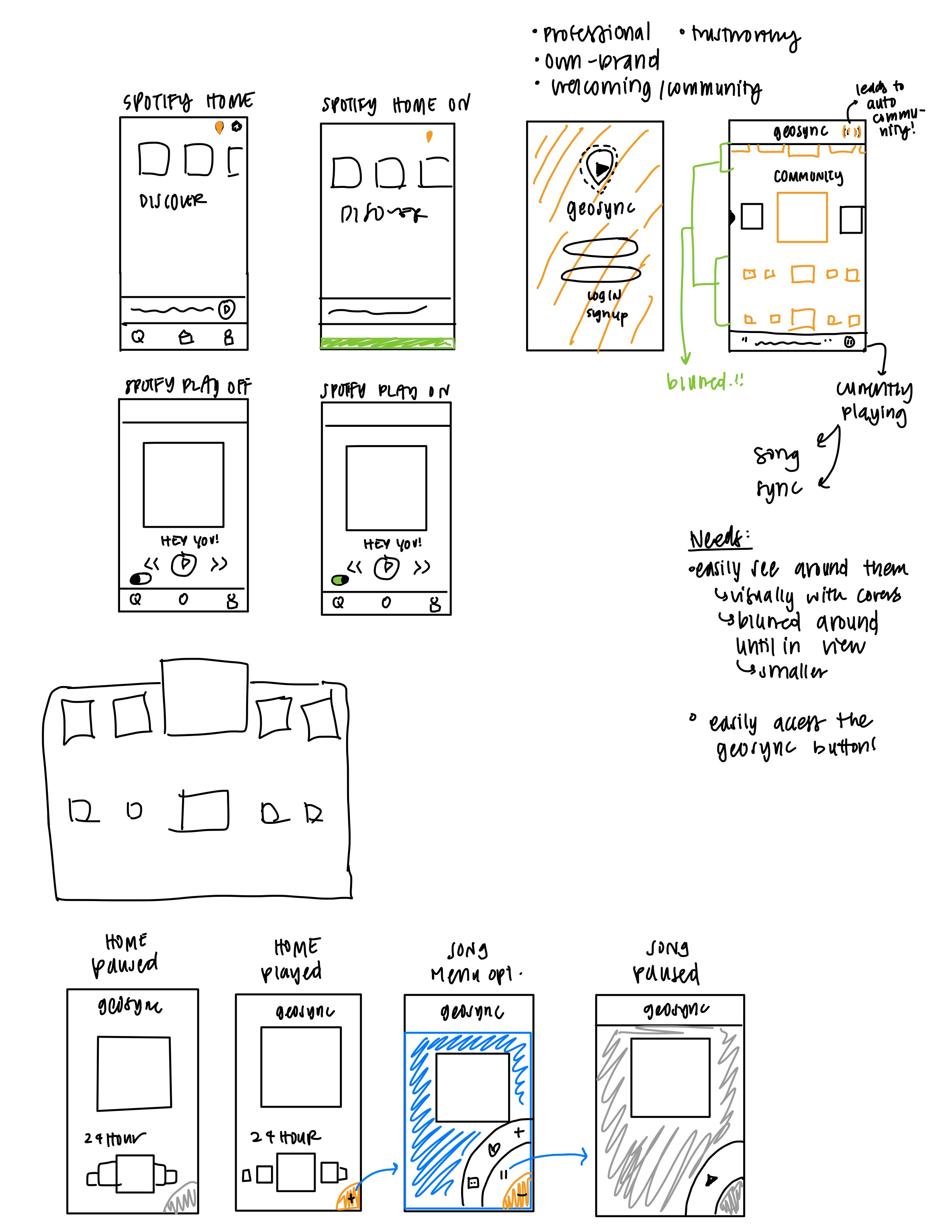
Flushed out design for ergonomic ease and a fluid social experience.
Ergonomic ease
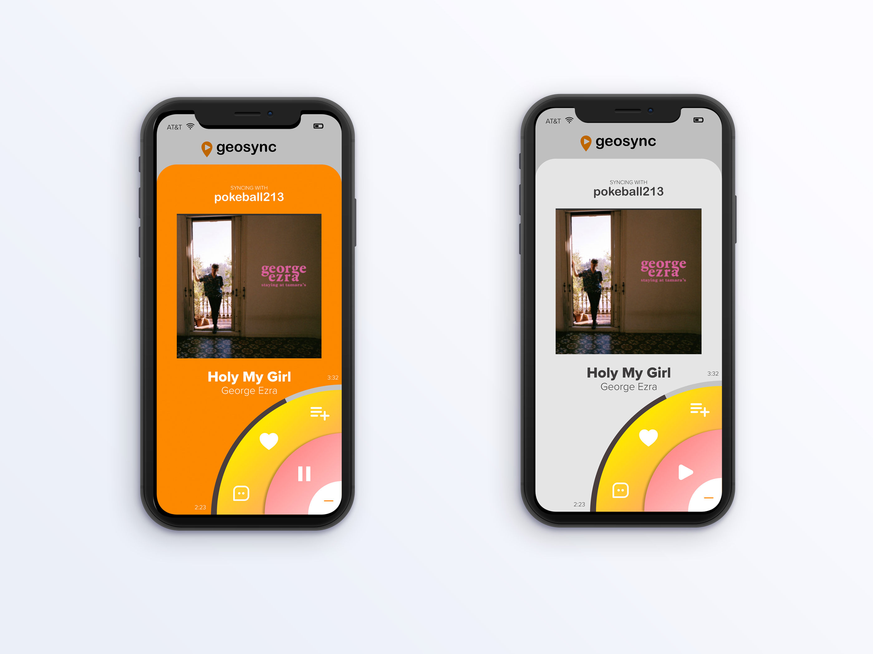
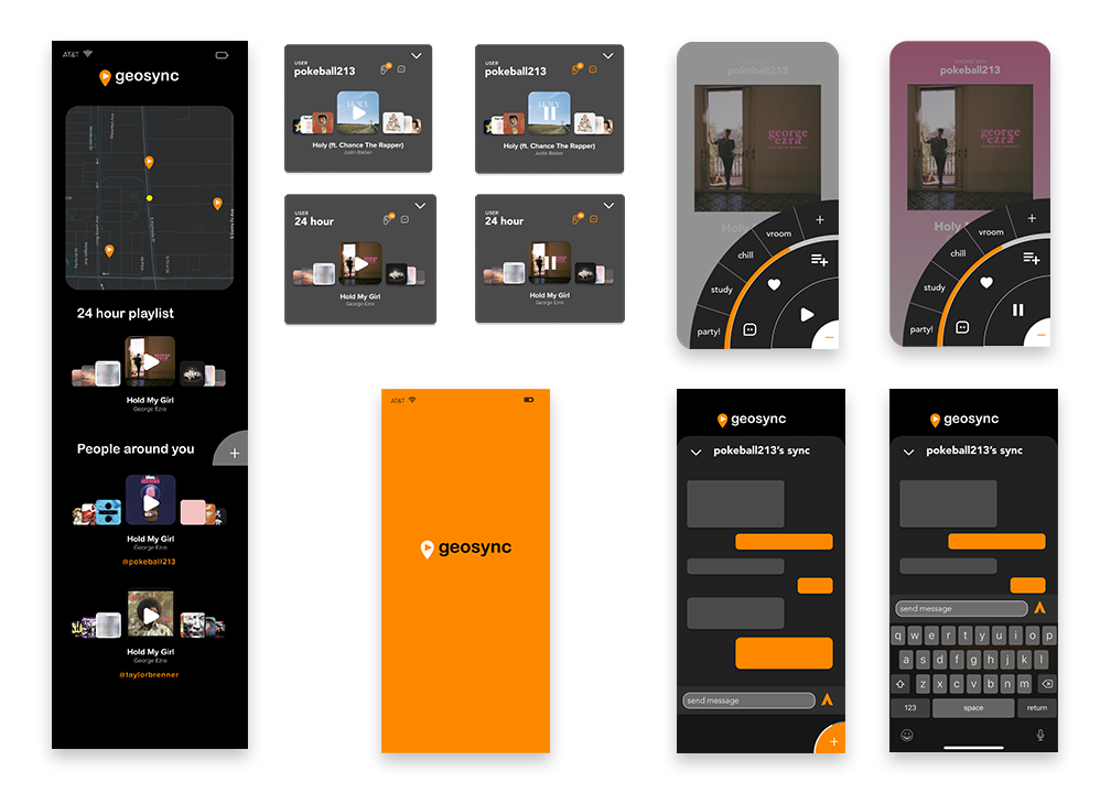
With the user in mind, the navigation button was placed on the bottom right. Clicking it leads to a circular menu for easy reach. No more stretching across the screen to add a song to your playlist!
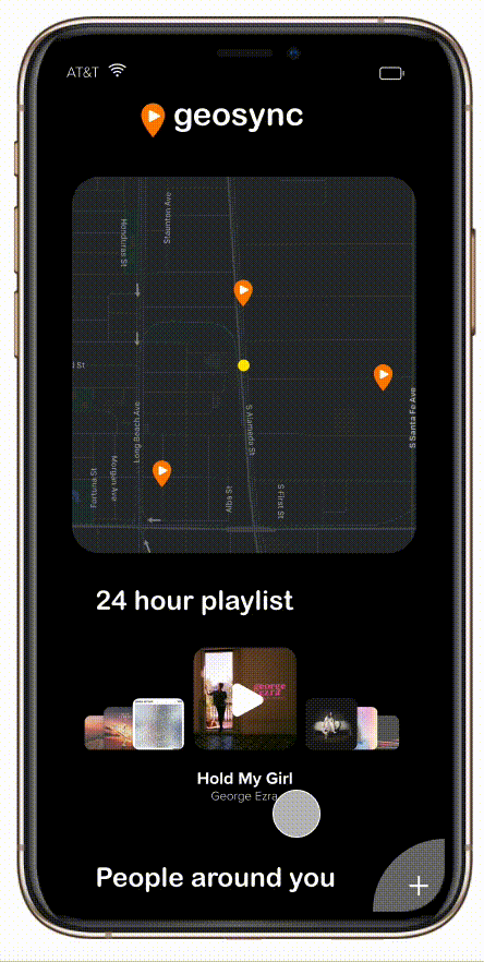
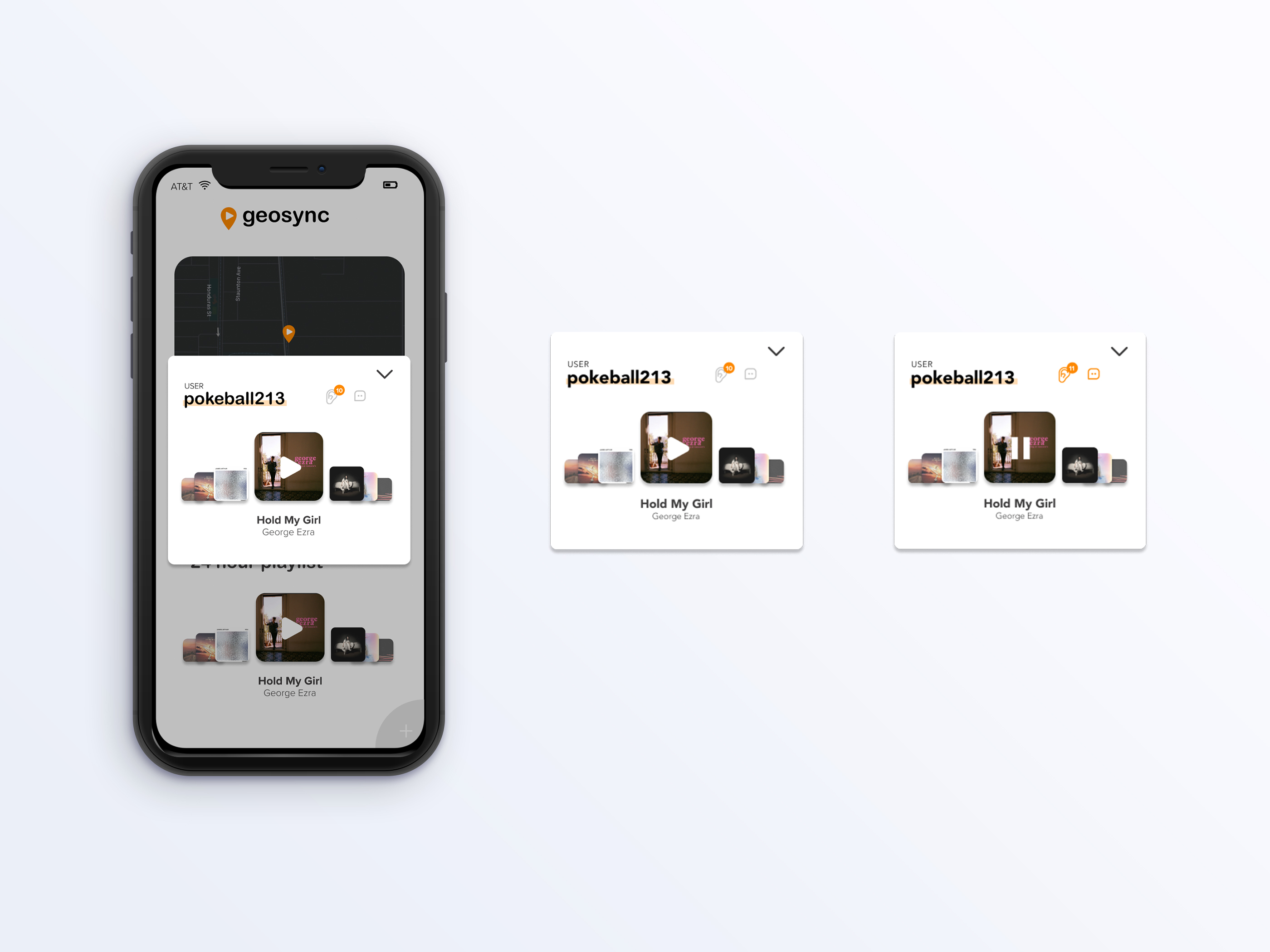
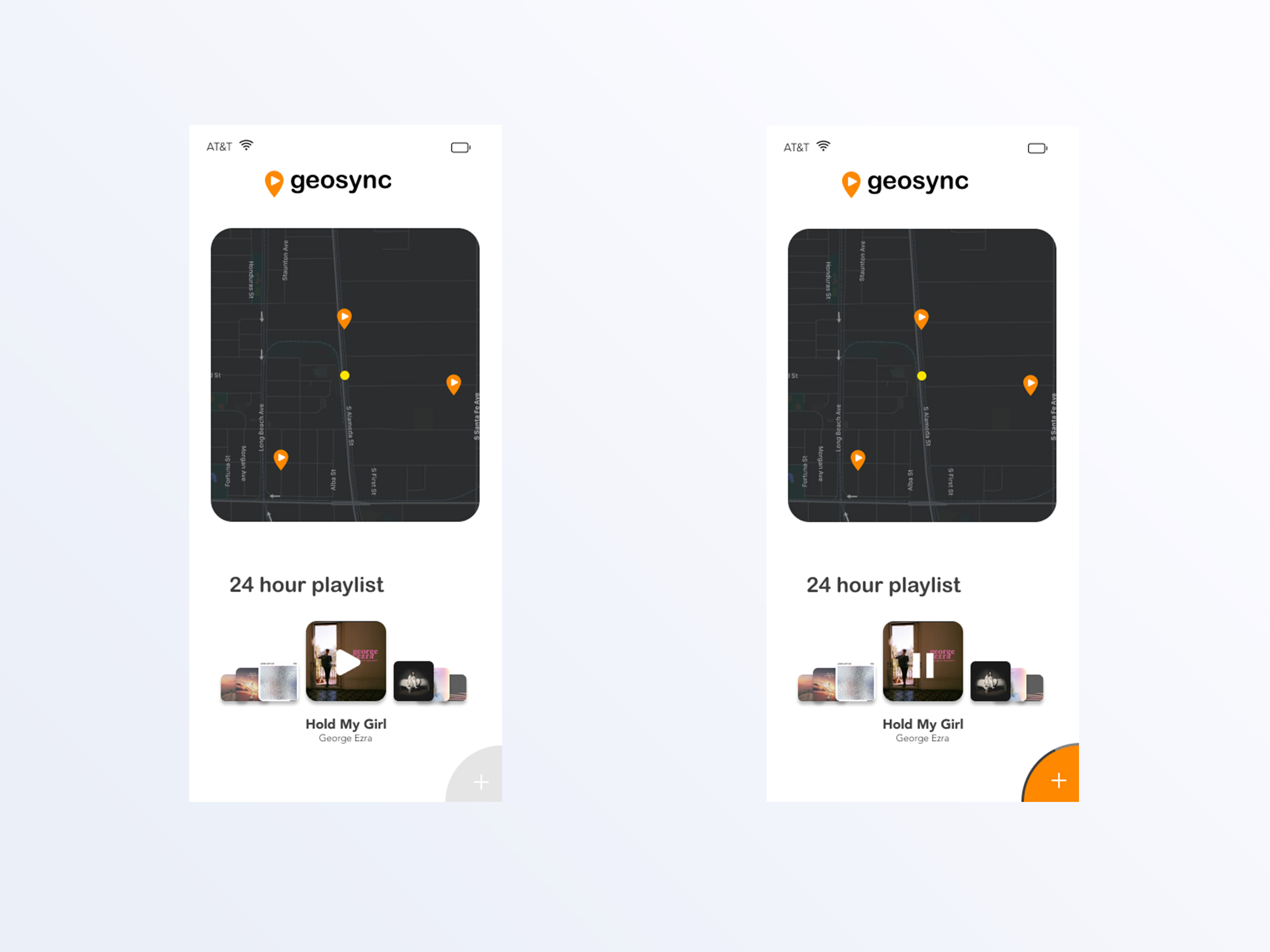
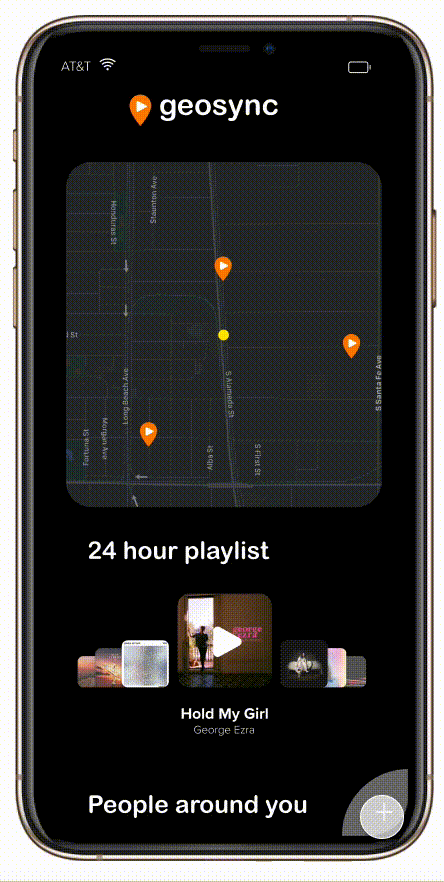
Sync your listening with those around you.
Users can use the visual map or scroll down to view other users on public mode. Clicking play will sync their listening experience. On the pop-up, users can easily see how many people are listening with them and share their thoughts via DM.
Colors to visually indicate play or pause:
Play = colored
Pause = gray
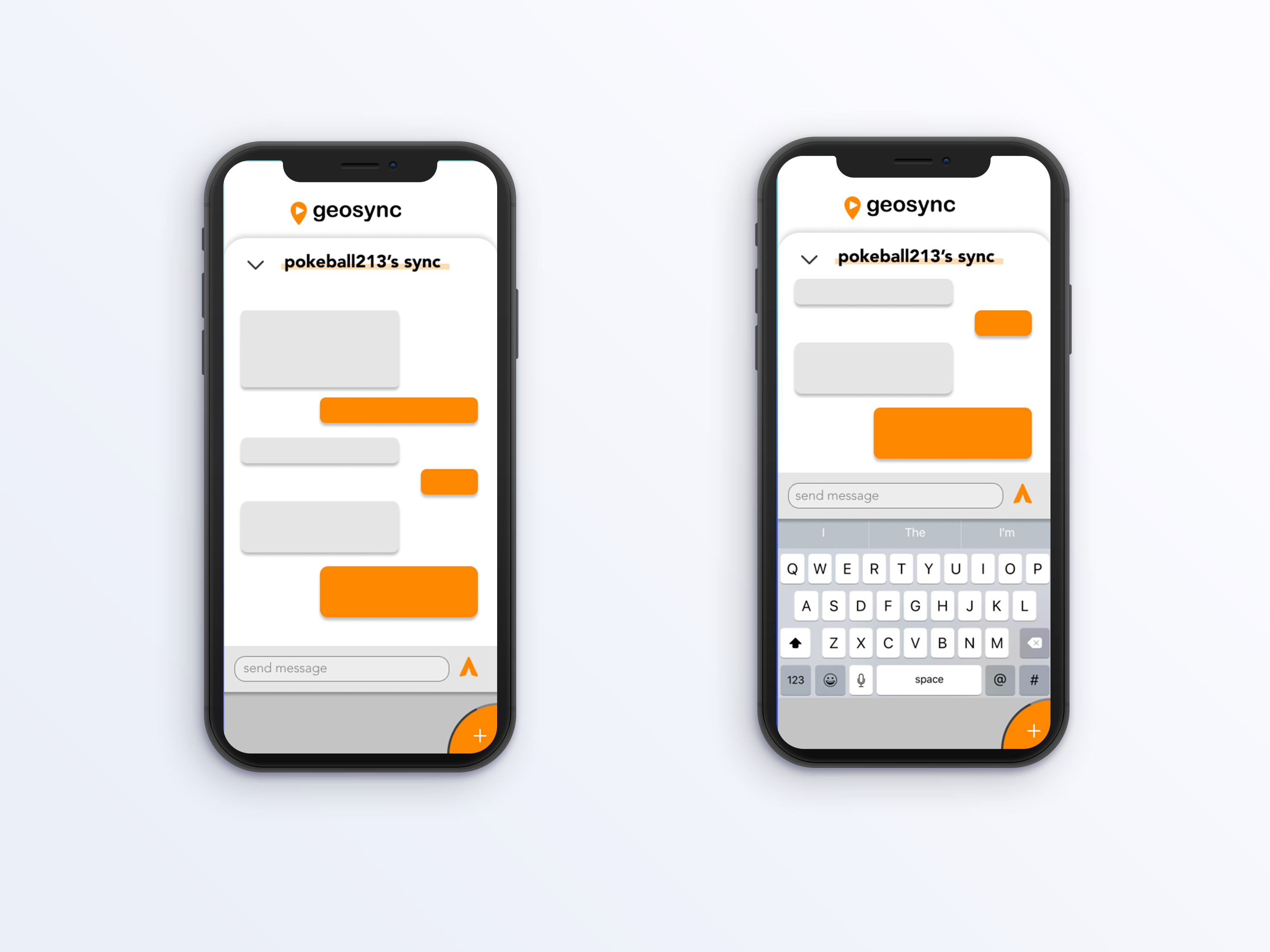
Messaging to spark connections
Taking social connection further with a messaging capability.
Making it social
Users can connect with others by syncing their music with those around them. Once the users join in, they can DM the playlist owner with their thoughts. Users can also join in on a constantly updated 24 hour playlist that collects songs from listeners who had passed by the area in the past 24 hours.
Accessible menu and color indicators
Users can easily tell if their music is on play or pause since the background color changes accordingly. The colors automatically draw from the album's colors to bring more dynamic to the listening experience without clashing colors. The radial menu allows for easy thumb reach and can be switched to the left side for left-handed users.
The overall experience
Through connecting with those around one, Geosync bridges the social and private experience of music listening.
Iterations
I explored a light mode version as well.